Wattsupwiththat brings us the story of the curving line. Just when the Arctic ice seemed about to break through the long-term average, it made a sudden downturn. Anthony Watts' reader Anthony Scalzi prepared this animation:
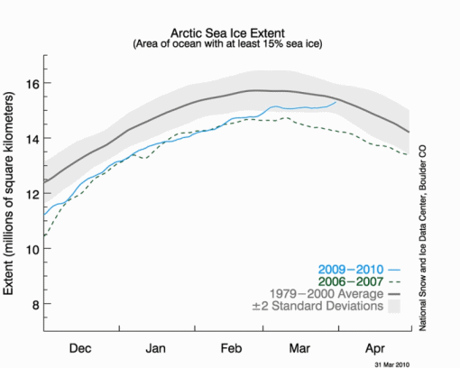
The shape of the curve for each day actually changes (goes lower) on the subsequent day. As someone with expertise in computer science, I cannot see any way this can be an outcome of an automated algorithm of any reasonable design. To make the shape clear, I interspersed the four days' images with an image showing all four shapes:
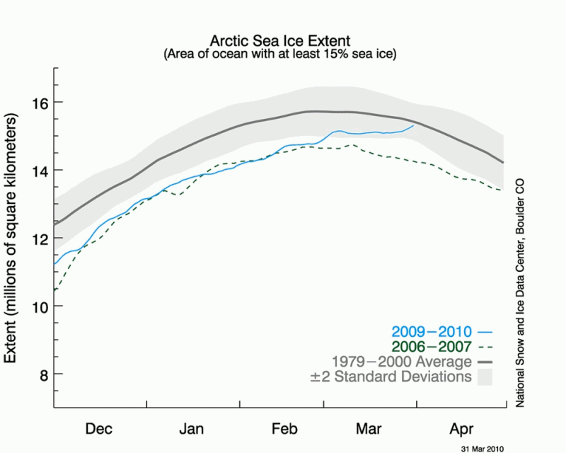
(Click image to see it enlarged.)
The curve resembles most a piece of rope being pushed forwards and flopping over; it doesn't have any hallmarks of an evolving record of fixed historical events at all.
To me this seems to have fraud written all over it. BTW, if anyone thinks WattsUpWithThat is just a "shill for Big Oil" or some such, Anthony Watts' reticence to point the finger at this strange (to say the least!) sequence of graphics should change their minds.
What we really need is the actual data - no, not as it can be downloaded today, but as it was on the server at the same time each plot was put up. But unless someone has done this, I don't see how we can trust NSIDC.


Recent comments
9 years 2 weeks ago
9 years 13 weeks ago
9 years 13 weeks ago
9 years 13 weeks ago
9 years 14 weeks ago
9 years 15 weeks ago
9 years 16 weeks ago
9 years 16 weeks ago
9 years 16 weeks ago
9 years 16 weeks ago