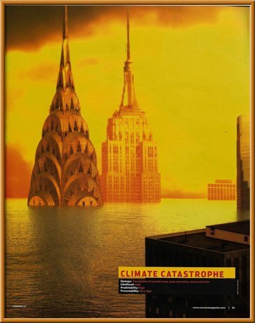
A picture is worth thousand words. And here is the picture I am concerned about:
That's from Cosmos, "Australia's award-winning science magazine". And awards they have, too. Their editorial page tells us they have awards for, amongst other things, Magazine of the year, Editor of the year, Excellence in environmental reporting, Best analytical writing, and on and on.
But does something strike you as a bit fishy with this image? Gosh that's an awfully high sea level! If that is what is in store for us, we are all pretty much doomed. What does that say in the caption? Let's magnify it a bit (I've had to use false colours to show up the red on black of the original):
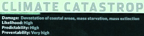
Wow. Can you imagine a well-meaning but lay reader seeing the picture and reading that caption and being shocked at humanity's reckless, callous indifference to planetary harm? I can. But how much can we trust "Australia's award-winning science magazine"? I should mention at this point that this isn't yesterday's issue, it is from Aug/Sept 2008 - I found it doing some housecleaning - so we can excuse the editor for not knowing what we now know about ClimateGate and all the malfeasance in the various IPCC reports that has surfaced since then. So I can speak freely without drawing any inferences about the authors of the article.
Well. Let's start at the bottom: "Preventability: Very high". Here's what Jo Nova has to say about that:
Assume the IPCC is right. Assume that Australia would have kept emitting the same proportion of global emissions of CO2 for the next four decades — despite the rapid catch up in emissions-per-capita as the developing world gets cars, frozen foods, and holidays-in-Bali. Then assume somehow, theoretically, we might be able to completely stop emissions of CO2 suddenly (by Tuesday). What’s the most generous possibility of success we could get from massive Australian sacrifice and green action now? Answer: Tops, absolutely as high as it gets, exceeding beyond our wildest expectations — if Australia stopped emitting CO2 tomorrow, we could save … 15 thousandths of one degree of warming (0.0154 °C) by 2050. Spiffy eh?
No extra comment necessary. Next: "Predictability: high". Ponder the unpredicted ten or more years of declining or stagnant temperatures, or the falsified predictions of a decade ago that snow in the UK would become a "rare and exciting event". Tell that to Britons digging themselves out of deadly snowdrifts winter after winter.
Then there's "Likelihood: high". The IPCC uses its very own definition of "likely" that has no basis whatever in any sound statistical methodology.
We are left with "Damage: devastation of coastal areas, mass starvation, mass extinction." Again going from the end to the beginning:
"Mass extinction": All climate theory agrees that global warming warms the poles more than the equator. That includes the geological record (which we would do well to heed) and also the climate models (which we would do well to 'file' in an appropriate location). So the only species that could be threatened by extinction due to global warming are polar species that might run out of cold habitat. All other existing species will still have a place on Earth to suit their temperament. And every cold-adapted species - indeed, all species - have already survived the Holocene climatic optimum 8,000 years ago that was one or two degrees warmer than now, as well as the Eemian interglacial 100,000 years ago, which was some degrees warmer yet again. Every species has survived the complete loss of arctic sea ice - even polar bears.
We come to "Mass starvation". CO2 is plant food! Can't say it often enough! The world has greened an extra 6% in eighteen years thanks to industrial emission of carbon dioxide. Despite religious beliefs to the contrary, human beings can indeed do something good for the world without really trying.
And that leaves us with the 1,000-words - sorry, the picture - showing the "Devastation of coastal areas".
So back to point one: gosh, that sea level rise looks really scary! But is it real, a slovenly error by "Australia's award-winning science magazine", or a deliberate lie by ditto? Well to start with, it ain't real, that's easy to dispose of. Here is a diagram of New York's leading skyscrapers prepared by Jerchel:
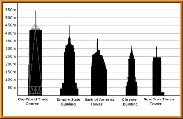 From this height comparison diagram, we can clearly see that the two main buildings shown are the Chrysler Building and the Empire State Building; and from the shapes, it seems likely that the piece of building in the foreground is the Bank of America Tower.
And all three are precisely aligned on the 250-metre mark.
Take a good close look at the Chrysler Building in particular, at the place where the sea meets the top windows. The accuracy of alignment at 250 metres couldn't be any closer. So how much will, or could, the seas rise?
For a science magazine that boasts that this event has predictability: high, this prediction couldn't be more wrong.
The absolute worst that could ever happen is that all the ice in the world melts. Science is about seeing for yourself, and this is a pretty easy figure to work out, so I really recommend calculating the sea level rise yourself. It is easy to do a ‘rough and ready’ calculation as follows: Look up on the web the total Antarctic ice volume (it’s about 30,000,000 cubic km). Now assume it all melts. So multiply that by the density of ice (about 0.91) to get the equivalent volume of water. Now assume it is spread all over the oceans, so look up the area of the world’s oceans and divide the water volume by that number. If you looked up the same number I found, you should get about 70 metres.
That figure is not accurate for all sorts of reasons (compression of ice and water changes the density, the rising water will cover a greater area as it inundates land, land will change its height due to a phenomenon called isostatic rebound, and so on), but there is something really nice about actually calculating a number for yourself and seeing with your own eyes the reason for the number. A presumably more accurate figure from NASA is 60 metres—not too far off the rough and ready number. The melting of Greenland's ice would add another 6 metres, giving about 66 metres of sea level rise if all the ice in the world melted.
So right off, we know the scary picture is wrong. As each successive metre of sea level rise needs more water then the metre before (because it covers more land, so there is an ever-greater area of ocean to be covered as levels rise), we can say, very conservatively, that the scare picture exaggerates by more than a factor of four. There isn't even a quarter enough ice available in all the world to ever make that picture come true.
That leaves the choice between sloppy reporting and dishonesty. I wondered why the alignment is so precise at 250 metres. Is it just that a graphic artist was told "Make us a scary picture" or because this is the highest round number that still leaves enough of the buildings visible for them to be identified? Either way isn't very flattering for "Australia's award-winning science magazine".
The reason I am mentioning this Cosmos article at all is the wider issue raised, both in this example and many others, of false emotions and beliefs being generated in the wider public by careless or dishonest reports about global warming - and, particularly, about things that are not actually put into words where they can be rebutted, but are injected subliminally - such as by this completely fallacious image.
Everyone 'thinks they know' the truth about global warming - the "science is settled", catastrophe awaits, and all the rest of it. But most or all of what people think they know is either outright dishonesty or falsely constructed biased reporting. No one writes about global warming and shows a picture of the water lapping at, for example, the edges of the road by the beach; the image is always distorted on the alarmist side. (And even water lapping the road will probably turn out to be exaggerated, but let that one pass.)
Finally there is the question, even if we accept the fantasy that these skyscrapers could be submerged to the degree shown, of the time it would take for all the world's ice to melt in order to do so.
The same NASA announcement referenced above tells us today’s melt rate is 100 cubic km per year, so from the total ice volume (see above) divided by this number, we see that at the present rate, it would take 300,000 years to melt all that ice and get a 66 metre sea rise. If the melt rate were fifty times today’s, which would require scorching temperatures that no one is predicting, the melt could happen in 6,000 years at a rate of ten millimetres per year. That is the absolute worst that could possibly happen. By that time these buildings will be well past their use-by date, making the image fallacious for a completely different reason, in this case, that the rise could happen in any timescale in which those particular buildings are still standing.
We've been fed a diet of lies about the plant nutrient carbon dioxide. We mustn't lose track of the fact that we are also being fed a diet of unstated, subliminal misinformation. Absolutely nothing coming from the alarmists can be trusted to even the smallest degree. If they tell you water is wet, go have a shower to double-check!

Re: The Greatest 1,000-word Lie Ever Told?
Well, if that thing turns out as a lie. I can't even think that someone can say it. But, as a human, we must respect the opinion of the others.